Wayne Thiebaud, now nearly an octogenarian, may have started out as a populist illustrator of sweets but has increasingly become an important–even classical– draftsman, as this excellent show at the Morgan Library makes clear. The artist’s beginnings were in commercial art, but in 1956-57, he spent a year in New York, where he was taken with the abstract-expressionists, whose penchant for untrammeled formal freedom acted as a lure for the West Coast-based painter and draftsman. Some of this liberated attitude toward the medium of paint found its way into his signature cakes, pies, parfaits, and candies, arranged in rows on pristine white countertops that highlighted the colorful treats for which the artist is known. When this particular style made itself known in 1962, Thiebaud was inevitably taken as a Pop artist, and was mentioned in conversations that included artists such as Warhol and Lichtenstein. But an exact match didn’t fully occur; instead, Thiebaud’s bakery items, displayed on glass shelves, seemed to be as much about painting–even on a historical level–as they concerned the American devotion to a Pop orientation–scenarios emphasizing enjoyment but also bordering on shallowness. The point is that even when Thiebaud’s audience was contemplating the array of desserts he had painted, bigger, and deeper, ideas about representation were innate to the imagery.
But this orientation was not fully realized until the 1970s when Thiebaud fully discovered the pleasures of Old Master drawing. He had spent his early years–in the late 1930s up until the early 1950s (when he decided he wanted to be a fine artist)–painting in a manner influenced by his commercial training. This was not necessarily a false start–we remember James Rosenquist’s beginnings as a sign painter, which fully supported his forays into the world of popular art–indeed, it gave Thiebaud the ability to work economically and with more than considerable clarity. Still, the content of this work was commercial, and it was not until the middle 1950s that he broke into an idiom influenced by Pop art, albeit one strengthened by its fidelity to nature. Ever since the heyday of the abstract expressionists, Americans have been taken with a messy freedom supposedly indicative of inner liberation–think of the work of Cy Twombly, whose sketches almost feel like they were dashed off on bathroom walls, mostly because of their deliberate lack of control. In contrast, even though we find serial repetition in the pies repeated with very small variations, and abandon in much of the brushwork, it feels true–at least in retrospect–that Thiebaud’s paintings have a strong formal approach. They are at least as much about the development of a style as they are a colorful comment on the pleasures of American food. The sweets are, more than anything, exercises in form. This may have been hard to see at the time, but in light of experiencing Thiebaud’s career overall, the formal elements become at least as important as the sweet-tooth contents he chose to portray.
No one escapes the general esthetics of the time in which he is working, and Thiebaud is no exception. He belongs, clearly, to the generation of artists who came of age in the 1950s, when abstract-expressionism was coming to an end and Pop art was starting to take over. Merging a luscious brushwork with a luscious content was Thiebaud’s way of bridging opposing impulses–and this is something he did spectacularly well. Fine art’s capacity for transforming its style–in a very short time–is a characteristic of the way images have been made since the middle of the last century. We have described our times as pluralistic since the 1970s, but this epithet hardly does justice to the huge amount of variation we find today. Yet Thiebaud began before that, when the number of extant movements were few. It would be easy to call him, now, a stylistic survivor, but that would not do justice to the fineness of his hand. It must be remarked again that he was never in entirety an expressionist artist any more than he was someone given only to Pop. Instead, Thiebaud merged content and style partly by hiding more historical notions of painting and drawing. This suppressed interest in historical art would become more discernible around 1970, when the artist was fifty, at the height of his powers. At the time, American art was taken with minimalism, conceptualism, performance art–not-so-coded attempts to change the way we saw things. Thiebaud may well have wanted change as well, but he inflected his energies toward a draftsman’s sensibility, in which precision and close truth were to be preferred over a broadly expansive approach. Later work, in particular, the impossibly vertical perspectives of San Francisco streets, would convey his penchant for sharp observation, as well as a slightly surreal view of the world. Thiebaud never lost his sense of the specific: The curious presentations of the cakes and pies seem delectable at least in part because of the close observation they were given.
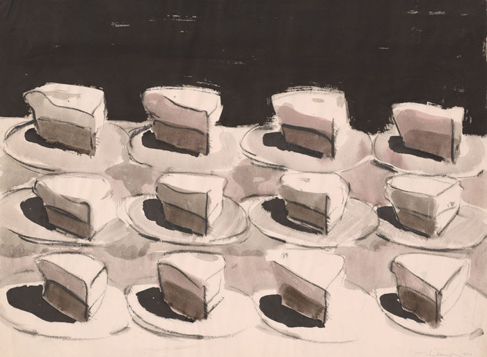
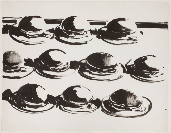
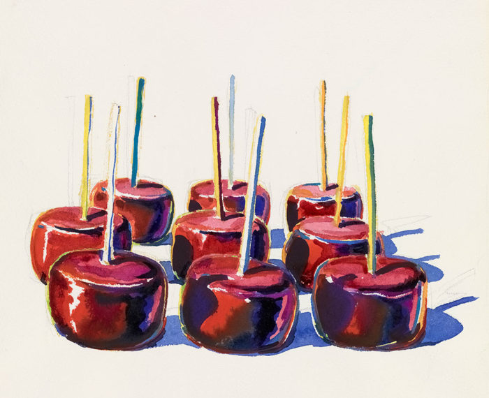
If we look at the imagery Thiebaud produced in the middle 1960s, we see a focus on sweets, done in an engaging style. Nine Jelly Apples (1964) is familiar to anyone growing up at the time; three slightly skewed rows of bright red candied apples with flat tops and differently colored sticks stuck in the middle of the fruit. Who could resist the apples? Our wish to consume them is at least part of their charm. At the same time, they have a clarity that is unusual for the subject; the sticks add a bit of energetic drama to a scene that is notably conventional. In a way, it is an encapsulation of the American dream–but this is likely reading the work too symbolically. We are meant to enjoy, and we do. Four years earlier, in 1960, Thiebaud painted an iconic work called A Shelf of Pies. Three rows of pies, with a cream topping and, likely, a cream bottom, sit on a white table; the background above the desserts is black. These desserts are hardly a reading of American life, but they actively participate in it–and still do: the American appetite for sweets is legendary. Again, it is a mistake to invest the image with great depth; they are no more than what they are. Finally, a study of hamburgers, produced with brush and ink in 1964, shows a group of them, in three rows. The top part of the bun is usually white with reflected light. Is this a metaphor for our national appetite? It is hard to say. But it is a delightful presentation of the country’s favorite repast, rendered as objectively as possible.
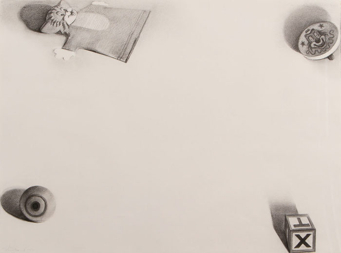
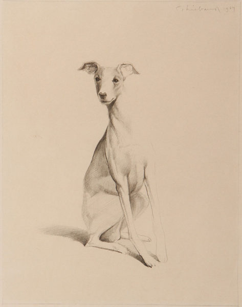
Two drawings, roughly of the same period, Dogs (1967) and Toys (1971), are done with graphite and charcoal respectively. They are innocent enough as subject matter, but they also reflect a deepening interest on Thiebaud’s part in the technical nature of draftsmanship. To this viewer, Dog rivals the work of David Hockney, already renowned for his drawing when Thiebaud made the work. It is an image of a whippet sitting on its hind legs; the front legs extend vertically in front of a taut body. The animal’s face is intelligent; its early flop over and end in sharp angles. The drawing is an exercise in sympathetic imagination. The objects in Toys are, oddly, placed in the corners of the composition. On the upper right, there is a top with a clown’s face directed toward the viewer. In clockwise order, there is a building block on the lower right; a ball or sphere with an eye encircled by a thin line on the lower left; and, on the upper right, a puppet with the head of a cat seen in cartoons. The shadowed drawings are made with great accuracy, and prove just how early Thiebaud took interest in rendering nondescript objects in close detail. These are not drawings an Old Master would do–we are not looking at likenesses of Christ but playthings. But we do see a truthful vision of what we come in contact with is alive in these two works. It doesn’t matter if the theme is less than sublime. In this sense, Thiebaud is very much of his time.
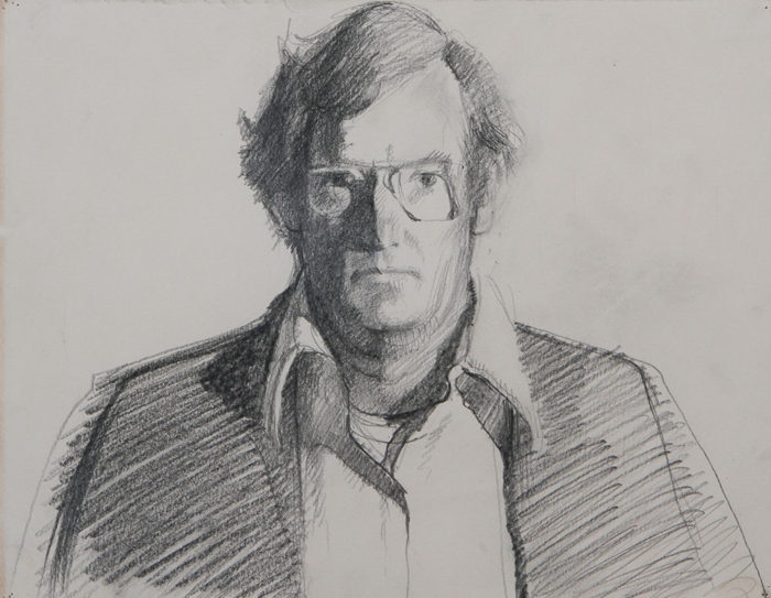
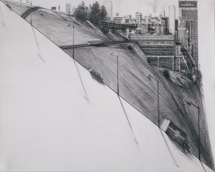
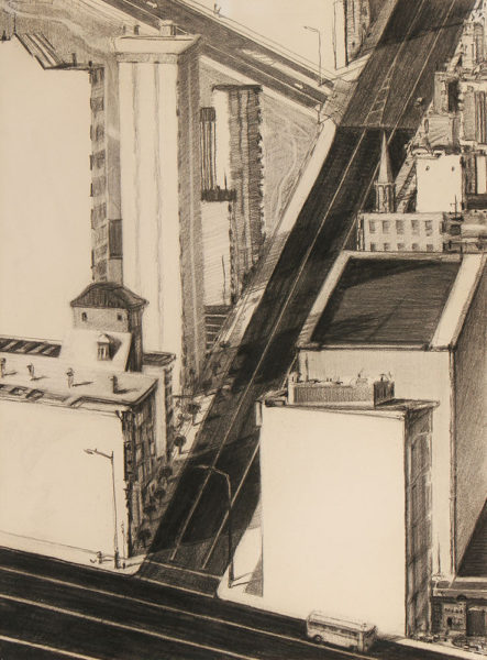
A graphite self-portrait from 1970 lets us look at how Thiebaud saw himself–as a figure of manly energy, with a forceful gaze intensified by glasses, an open white shirt, and a sport coat. The skill of the drawing is highly achieved. It leads to the accomplished studies of local San Francisco streets, surreal in their extreme perspectives, made believable because of their detail. Diagonal City (1978) cuts the work in half, separating a simple white expanse from a much more detailed view of urban structures by a diagonal line. Two small cars and a larger truck, separated from each other by some distance, make their way downhill, while above them, at a perpendicular, a bus travels on an asphalt road near the top of a hill. Beyond the hill, in the background, is a complicated study of buildings, their overall forms and window patterns creating a stunning, intricate view. Only the eccentricity of the composition identifies it as a contemporary work of art; otherwise, the skill is remarkable–and consonant historically with efforts preceding him. An even later drawing, Three Roads (1983), demonstrates the artist’s ongoing affinity with precise rendering; an asphalt road cuts a diagonal through the middle of the paper; toward the top, there is a tributary lane. At the bottom is a broad width of an avenue. Lining the diagonal street are bright apartment buildings, varying in size and shape, that face each other. They enact the architectural drama of streets without a name, faceless in the greater environs of an environment most would not easily recognize. The contrast between light buildings and dark avenues is key to the success of the drawing.
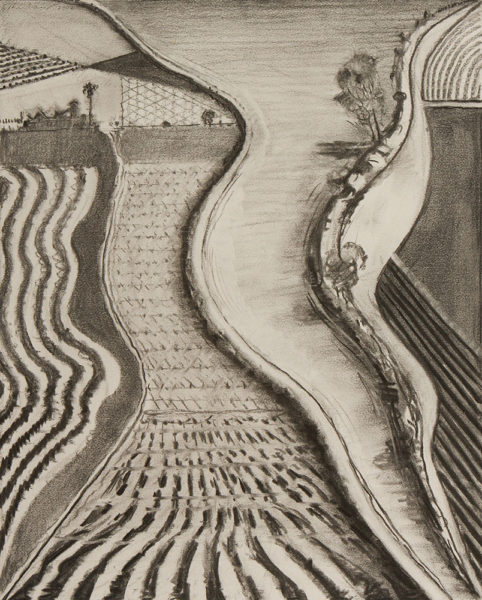
A final look at relatively recent art by Thiebaud reiterates what we might have intuited from the start–that this man’s talent would inevitably shift toward compositions unusual for their technical complexity. This is not to deny the interest of his content; Thiebaud’s work consistently offers a point of view that is accessible, no matter what he is working on. Yet the matter of craft becomes increasingly important as time goes on. A sheet of sketches that includes a close study of a movie billboard emphasizes cross-hatching, a technique made use of by Thiebaud late in his career. The themes are pedestrian, even as the technique deliberately evokes achievement. There are seven small sketches; on the top left is a “tall couple,” a man and a woman, leaning on walls across each other, communicate something unknown; behind them is the center of visual interest–the wall in the back, which is detailed by cross-hatching. On the upper right, with the words “club conversation” written beneath the sketch, are two men in discussion in two very large club chairs. A painting, likely an abstraction, occurs on the wall behind them. The billboard drawing on the lower left shows the face of a beautiful brunette on a wall; her outsize dimensions dwarf a man in a suit and tie on the sidewalk in front of her. The comparisons between dimensions are comic. Most recently, Thiebaud has been paying attention to the landscape–Study for Brown River (2002), like the sharp inclines of the San Francisco streets, disorients the viewer with its complexity. Here an array of patterned farmland feeds off the river moving down the center of the work. The thin lengths of land have mark-making distinguishing them–patterns that emphasize plants or the start of crops. The Study is an image memorable for its ability to convey a large amount of information very simply. The familiar offbeat quality of the image, generally central to the way Thiebaud works, again takes place.
To sum up–why is that Thiebaud looks so very good at this moment? It may be the longevity and persistence of his efforts; it may be the close rapport he has with cities and landscapes–and food as well! The larger point to be gotten from the artist’s output is his willingness to change the odd arrangement of objects and views. Thiebaud is better known for his sweets, but they seem secondary in light of the chances he has taken in the second half of his career. It is true he is risking mere oddity when he skews his views in the way that he does, but that is part of his idiosyncrasy as a draftsman–and idiosyncrasy is something sorely needed. His late works enable him–and us as viewers–to make sense of the West Coast, never a repository of “ordinary” creativity. At the same time, Thiebaud does not succumb to strangeness for its own sake–he has a plan. The content of his art ends up supporting the great gift of his skill. It is fitting that the Morgan Library, increasingly devoted to contemporary art, emphasizes the artist’s act of draftsmanship; it is central to the way he sees things. Art writers should never prophesy, but as time goes on, it is certain that this view of Thiebaud as an exceptionally talented draftsman will carry weight, allowing us to appreciate one of the best talents of our time.
Wayne Thiebaud, Draftsman at The Morgan Library & Museum
May 18 through September 23, 2018
Photographs provided by The Morgan Library and Museum.