Despite its various names–abstract expressionism, the New York School, action painting–the work seen at the “Epic Abstraction” show belongs to a unified field. The works are resolutely non-objective; more than a few are major paintings. As good as many of the works are, this sort of exhibition brings up the problem of abstract expressionism’s persistence today–or, likely more important, the measure of its historical achievements. The show, at this point, is truly historical–nearly every artist included has passed away. It demonstrates yet again the strength of an American painting style that we continue to cultivate, despite the fact that its major achievements took place in the middle of the last century. Given our obsession with the style’s often manic triumphalism, it is fair to question whether we are in fact overvaluing its lasting achievements. It is fair to see the period, roughly from the 1940s up until 1970, as a time of intense innovation, in which abstraction’s innate expressiveness was developed to a point of remarkably high accomplishment. But it may not be true to regard this art as belonging to a distinction regularly passing into greatness; our tendency to read the American moment, during which these abstract paintings were made, as a coup of unparalleled creativity strikes this writer as overblown, and even bloated. Whatever our feelings may be, there is enough time between then and now–the pursuit of the style in contemporary art is another question–that we can begin to consider, with true objectivity, the extent to which the high claims for abstract expressionism are accurate.
It is very important to do this because an objective discernment of the movement will provide current and future generations with a platform from which to further refine their perceptions. This is a strange time, in which art of the moment is treated as major. It is not. In fact, it is a time of chaos, poor skill, and an egotism that blots out genuine creativity. So we are taken with a rhetoric that doesn’t match the level of what we do. The overblown regard for the present also extends back to the past in art, making “Epic Abstraction” the kind of exhibition that would easily fall victim to triumphal over-estimation. At the same time, if we look closely at the show to estimate its strengths and weaknesses, we can try to cut through the fog existing between our need for greatness and the actual weight of the work. The artists in the show–Clyfford Still and Mark Rothko are particularly well represented–demonstrate an uncanny formal inventiveness, as well as a determination to treat paint as paint, rather than using it as a vehicle for figuration. Such an orientation meant that great freedom was being asserted for paint as a material alone; this was a further liberation from the notion that we have to paint in a way that (deceptively) represents the world as it is. By restricting paint’s usage to solely that of a material, artists could emphasize the action involved in making a work of art. Thus, the painting became a record of the painter’s immediate, intuitive decision-making. This kind of approach has been well understood for a long time, but a quick reiteration of the process is needed before we actually look at the art in the show.
The adjective “epic” also needs to be considered. What does it mean? The term is usually associated with poetry given to mythological and/or national assertion. But it can be used in painting as well. In this show, perhaps it means that most of the art is determined to attain grandeur–a visual sublime that would generate feelings of great height and depth in the viewer. Creating such emotions without overt historical references, either formally or in terms of recognizing actual events, seems difficult, but one of the great achievements of the style is to do so in purely non-objective terms. At the same time, the movement is really quite recent, which means that so epic an outlook may have been rhetorically too extreme–heroism in art has become more and more difficult to achieve over time, and indeed, it has been completely rejected in contemporary culture. We no longer trust the impulse at all, but maybe “Epic Abstraction” does prove that, for a very brief time, high intentions and accomplishments did in fact exist. It may well be that the movement rode a wave of new formal insight, one of such significance that it created art of the highest nature. So it may be as well that the heroic intentions of the artists who created such work could be developed to so advanced a degree because of the “honesty” behind recognizing that paint is simply a material, albeit one that could convey a remarkably broad and intense array of emotions. Usually (not always) grandeur in painting is associated with formal advance. Thus the understanding experienced in “Epic Abstractioin” represents a new way of thinking–hence its importance at the time, perhaps enduringly.
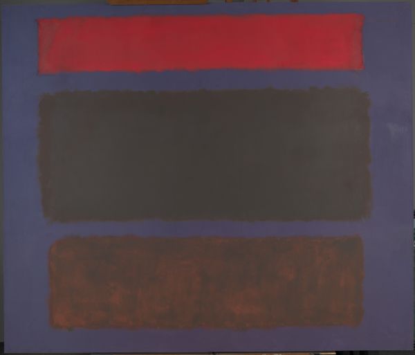
If we look at Mark Rothko’s No. 16 (1960), a somber but also luminous painting, we see just how fully emotional a purely abstract manner can be. Consisting of three horizontally aligned rectangles–a relatively thin red one at the top, followed by a dark gray rectangle in the middle and a dark brown one at the bottom–painted against a dark background, No. 16 conveys feeling of a deep-seated, even a tragic, nature (such a reading may also stem from our knowledge that Rothko committed suicide in 1970). The melancholic atmosphere is developed through somber, weighted color. It is impossible, in a work like this, and in the show in general, not to describe the art without the use of intuitive insight at least as much as analytic understanding. Rothko was a major artist, although the constant repetition of a similar structure can be regarded as a problem. Despite the caveat, it is fair to say that this structure was large enough, structurally and emotionally, to enable him to paint in important ways–suggesting not only pure abstraction but also hinting at a simplified landscape. In No. 16, what remains from our experience of the painting is a sense of tragic demeanor, not referring to anything specifically, yet presenting unhappiness in the extreme. Because we are aware of Rothko’s long, deeply depressed condition, we assume that the dark template he worked with reflected his mental state. At the same time,because he does not refer to himself specifically, we can expand our reading to a generalization.
Such an expansion reflects both the strengths and the weakness of the abstract-expressionist style. The emotional weight of the work in this show is always non-specific; that gives the paintings their ability to connect with almost anyone open to viewing them. But the lack of detail also precludes a view that would allow the show’s audience to tie their own response to something grounded; actually, the only artist belonging to this time who actually did come close, regularly, to figuration was Arshile Gorky, who used nature as his base; perhaps for this reason he is often described as a surrealist. But Rothko, like most of the artists here, was a practitioner of pure abstraction. So is Clyfford Still, another major American artist. His untitled work of the same year can only be seen as non-objective. His craggy, jagged edges, the signature of his style, vie with relatively broad expanses of paint. The combination of the sharp outlines, along with the color fields they contain, provides Still with an inherently dramatic presentation. In an untitled piece from 1960, broad swathes of black and dark red, with a thin vertical band on the right edge, build what can best be called a symphonic arrangement of color, in which feelings of a high tenor hold sway. The design feels nearly locked together, like the pieces of a jigsaw puzzle; moreover, the image hints at mountain peaks.. The white background lends contrast, as well as generating an uplifted mood. And the cerulean blue on the bottom-right edge offers the promise of the sublime when seen in contradistinction to the darker colors dominating the composition. All in all, it is a highly dramatic painting, in which structure is used to develop a field of taut, high feeling. This description generally serves as an accurate report on Still’s art, which in some ways in the most demanding of the works in the show.
Thinking about Rothko and Still, two of the abstract movement’s most celebrated practitioners, we can see how gestural abstraction can lend itself to both painful ambience and exalted report. This is done, in their cases, without the detail we might expect, which would explain the event behind the feeling. But no event exists, outside of paint being treated as its own reason for existing. At the time, this practice was innovative; today, it is nearly moribund, with the exception of a very few individuals who maintain creativity within the heavily predetermined style. To comment briefly about the persistence of the movement today: action painting continues to be liked and followed if not necessarily advanced. Generally, we are in a moribund state in contemporary fine art; Theresita Fernandez, the American installational artist, and Olafur Eliason, an Icelandic installational artist of equal stature, come quickly to mind as artists who have already accomplished a lot, and who remain cutting edge in the field. In the genre discussed here, there are the examples of Amy Sillman and Louise Fishman, both of whom remain committed to action painting and who have even pushed its vocabulary forward a bit. And in sculpture, there are the examples of Petah Coyne and Ursula von Rydingsvard; both artists seek a visionary mediation between nature and art. But these artists are middle-aged and older; the generation under fifty has been hard-pressed to arrive at a language or a body of work that feels immediately permanent.
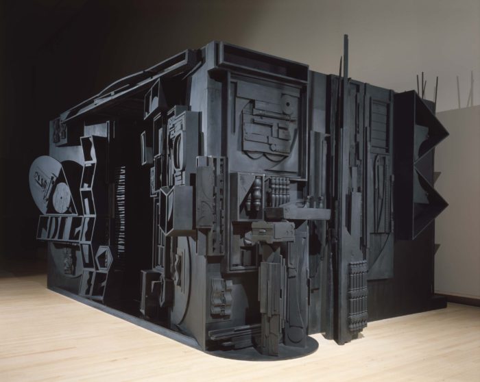
As has been noted, almost all the participants in “Epic Abstraction” are gone. Hungarian painter Judith Reigl, from Hungary but now in Paris, is still living at the age of 95; her dark work, consisting of two gray masses standing on top of other, is remarkably resonant. So it cannot be helped to see the show as a historical overview; the holdings are pulled from the Met’s collection, and while there is, as I said, no real shortage of powerful paintings, neither is one convinced that the art has attained, for the most part, a magnitude we feel compelled to admire. Still, the art remains thoroughly convincing: Japanese-American sculptor Isamu Noguchi contributes a sand-colored work, Kouros (1945), which attains its greater than human height by fitting in locking in puzzle pieces that build the work upward. The Greek work “kouros” means young man, and while the energies associated with such a sculpture are abstract, the overall form nonetheless conveys the physical presence of a powerful youth. British sculptor’s bronze work, Single Form (Eikon) (1937-38; cast 1963), relatively small but monumental in feeling, has the color of a dark verdigris. Its form is is that of a triangular cylinder rising upward at an angle. Its overall shape resembles slightly the oversize portrait of Balzac by Rodin. Both works jut into the air in a skewed fashion, thus accentuating the force of the form. And contemporary artist Chakaia Booker, who most regularly uses cut or shred rubber tires to create highly tactie abstract sculptures, is presenting Raw Attraction (2001), a raw mass of cut tire rubber. Here the material nearly conquers form; the dense, heavy rubber–the signature feature of Booker’s work–begins to exert an effect on the artist’s audience in its own right; the sculpture triumphs by means of its physical weight and the taut cuts made into the material.
One wonders a bit whether “epic” is accurate in its overall determination of the art on display. Some of the works feel merely like they belong to the world of lyric, or gestural, abstraction; a deliberate grandeur is lacking. De Kooning’s lyricism is well known, but he is not thought of as an epic painter. Even in Easter Monday (1955-56), a powerful, and even a great, abstract painting, we sense that de Kooning’s preoccupation with the act of the brush predisposed him to something that would quickly become an endgame–as it did in his case (and many others). I am not arguing against his lyricism, nor am I denigrating his all-over painting technique. I am simply describing de Kooning’s preoccupation with a style that exists for its own sake, one that does not seek mystic truths beyond the act of art. In the painting neither the center nor the margins are emphasized; all areas of the composition are treated equally. The colors de Kooning uses are white predominantly, with bits of red, green, and a tan the color of flesh. It is harder to describe the actual pattern we encounter in the painting, being that the forms the design is comprised of are so manifold and different from each other, they can hardly be categorized. One experiences the work as an inspired palimpsest, in which the variations in shape, too numerous to list, hold together cohesively in a manner that defies explanation. In contrast, Robert Motherwell’s work, titled Homage to the Spanish Republic (1971), is deliberately grand, consisting of four gonad-shaped ovals separated by slightly curving columns of black. The long series is overtly sexualized in a deliberately male fashion; it is both a very strong painting and an act of sympathy with rebellion. Motherwell found a way of celebrating the anti-fascist forces that, sadly, were overwhelmed by Franco.

We associate American abstraction with a messy, emotional hand. But this does not always happen. The late Ellsworth Kelly is represented with Blue Panel II (1977), a painting in which a dark-blue square, slightly angled, takes up most of the space available. On either edge we come across a black background. The graphic weight of the piece is quite unusual and highly successful. The promise of the painting has to do with the measure and balance it enacts so well, although people who know Kelly’s art well might find in it an excessively simple, consequently asking the viewer to believe in the artist’s formal minimalism without technical evidence of his mastery. Carmen Herrera, more than a hundred years old and originally from Cuba. is showing Equilibrio (2012), an acrylic painting with three upside-down, black, pyramid-like structures, their points resting on what we would normally consider the flat bottom expanse of the form. It is an exercise of unusual control; the painting’s eloquence has been derived from the forms alone. The taut edges of the works by both Kelly and Herrera show just how broad a language abstraction can encompass–Herrera is still alive, proving that art like this (and also abstract painting handled more freely) can be followed in powerful ways. Clearly, the genre–the style in its entirely–is still inherently capable of a very broad range of effects, which all the while remaining within the spectrum of a long-recognized idiom.

The late date of Herrera’s work–2012–indicates that the curators of “Epic Abstraction” are committed to illustrating their idea of an ongoing contemporary, non-objective sublime, epically developed via emotion, thought, and a deep affinity for paint. Other living members in the show cannot be described as young, but the energies brought forth by the paintings we see are youthful, no matter the age of the artist when he or she made the work. Work such as this, of a relatively recent date, may remain beyond a nuanced, and historically based, interpretation–our enthusiasm cannot be substituted for an impartial scholarly examination. My own feeling is that the period will be seen as important, but not great. This is because abstraction’s deliberate repudiation of the figure shuts down almost any route beyond that composed of the innate means of painting: form, color, and overall composition. These elements can be abstracted in brilliant ways, and it has been found that doing so doesn’t inevitably rely on a language owing much at all to figuration. But it is also true that we are caught within a language that is inherently limited; in many ways, the abstract movement, now roughly a century old, has been investigated to the point of exhaustion. “Epic Abstraction” ends up supporting my point because it demonstrates so well how long we have been working in a style diminished by previous explorations. This is no one’s fault; rather, it is a consequence of time itself, its inevitable repetitions. So, while we can and should admire a show of such clearly evident ambition and accomplishment, we can also look askance at abstraction’s future, given that we have solved many if not most of its possible puzzles. This does not mean individuals can pursue such painting with distinction, but it does mean that their explorations will inevitably occur in an isolated fashion, no matter how talented they may be.
Photographs provided by the MET Museum